2015年9月26日星期六

Week 9 -- Presentation Progress Demonstration

Week 9 - Presentation Progress Demonstration

This week we presented what we have done in last weeks and got many useful feedbacks.We have finished some main functions for our web application and improved UI for users.

What we have done:
1. Firstly, we improved our front page to make it more clearly for users. We clearly introduce our web on the front page and added instructions  for users.


2. Secondly, we fixed some bugs for the back- end issues and achieved basic function of our project. The information from Trove can be retrieved when user search related information. Moreover, we loaded location data on the google map dynamically. 


3. Thirdly, we began to wrote the html for our information page. We collected useful information and pictures for that page.

The Feedback:
1. Do not need the introduction on the front page.
2. Please add a scroll bar for users to show they can scroll down on the front page.
3. We need to explain why people will use our website 
4. Our goals are too simple and we need to add more interactive functions to engage users. 
5. Some users pointed that the video on the front page may be compressed to reduce the loading time. 

The Future Work:
1. We will continue to finish the information page.
2. We will combine all code together.
3. We will improve our functional to enhance user experience.
4. We will improve our UI and some icons.


2015年9月19日星期六

Week 8 -- Prepare Presentation for Progress Demonstration

Week 8 -- Prepare Presentation for Progress Demonstration

This week we continued to improve our project. Based on the feedback of paper prototype, we chosen some suitable ideas to improve our idea as well.

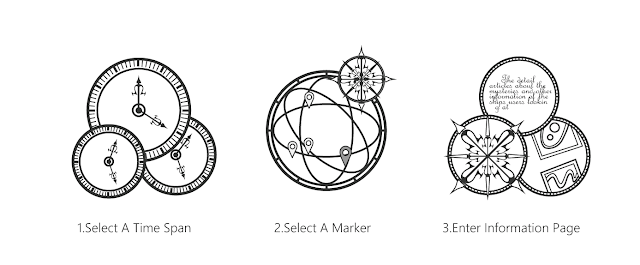
Firstly, for the design aspect, we decided a interaction plan to help our group to implement the whole project. Our web application is very simple and easy to use, and the logical of interaction is very clearly.


Secondly, for the front page, we nearly finished our front-end based on html, CSS and JQery. We have already built the basic function for the front-end.

Thirdly, based on our schedule, we continued to develop our back-end. We can load the location marker on Google map dynamically and connected the Trove API successfully.

Fourthly, we designed a success criteria to help us to do the user test.

Then we combined all materials together and prepared our presentation with Powerpoint. 

2015年9月11日星期五

Week 7 -- Paper Prototype

Week 7 -- Paper Prototype


This week we prepared paper prototype for our project -- Atlantis shipwrecks searcher website. We tested our prototype in the class and got many useful feedbacks. Our group prepared the tasks for users and observation goals for ourselves. We observed users workflow and users behavior with our prototype. Most users can find shipwreck information by themselves and thought our prototype was easy to interact. 


Tasks for user:
1. Using timeline to search shipwrecks information
2. Clearly know how to interact with the Google Maps
3. Successful gain detailed information.

Observation Goals:
1. How users handle with the navigation bar and hatch
2. How users get the accurate information on the target page.

3. How users feel about the UI and interactive plan.

Feedbacks:

1. Some students pointed that the front page should have an information button to help users to understand our web.
2. The button of timeline is a little bit confusing, some users thought that the timeline can be used to search for a specific year. 
3. Most of users were suggesting that we could add a function to share information to the social platform, such as Facebook.
4. One suggest was that we could add different languages for users.
5. For the front page, users suggested that it could be loaded automatically instead of clicking button.

2015年9月6日星期日

Week 6 -- Experience in the Poster & Pitch

This week we presented our design proposal. Our project is a website for shipwrecks. We got many useful feedbacks from other teams and tutors and we will consider these feedbacks to improve our project.


Prepared:

1. We finished designing UI for our web application mostly.
2. We began to decided what we would use for front-end and back-end.
3. We began to build frame for our web application

We would like to gather the specific feedbacks from users:

1. How users feel about our existing UI.
2. Please give some suggestions about functions.


Feedbacks:

  • Entry page should have one sentence to explain our website (Easy to implement)
  • The map should focus on Australia rather than the whole word (Implement)
  • Considering how easy to find information (Add searching box)
  • Using story to tell information
  • Pin journey to ships (Difficult to implement)
  • More information from other websites